Salix Fruits
Salix Rebrand
Art Director
Design Lead
Project Manager
Roles
Branding
Visual Identity
Thinking
Challenge
The Salix Fruits rebrand posed a complex challenge of diverse opinions across bilingual teams, demanding astute management of varying perspectives to establish a robust design system. The task involved evolving Salix's brand identity to thrive in digital realms, ensuring market relevance through a fresh, cohesive visual strategy that resonated across both English and Spanish-speaking audiences. This endeavor required a sophisticated blend of creativity and strategic thinking to transform and unify the brand's presence in an ever-evolving market landscape.
The logo before
Solution
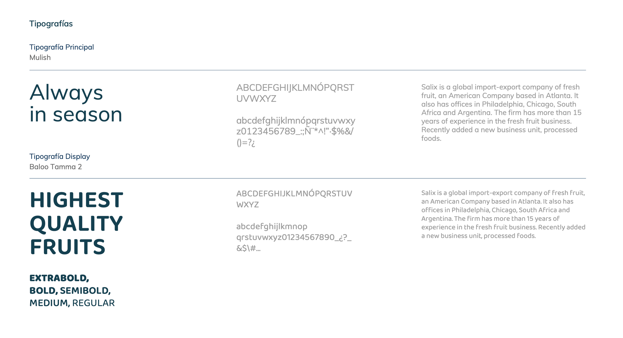
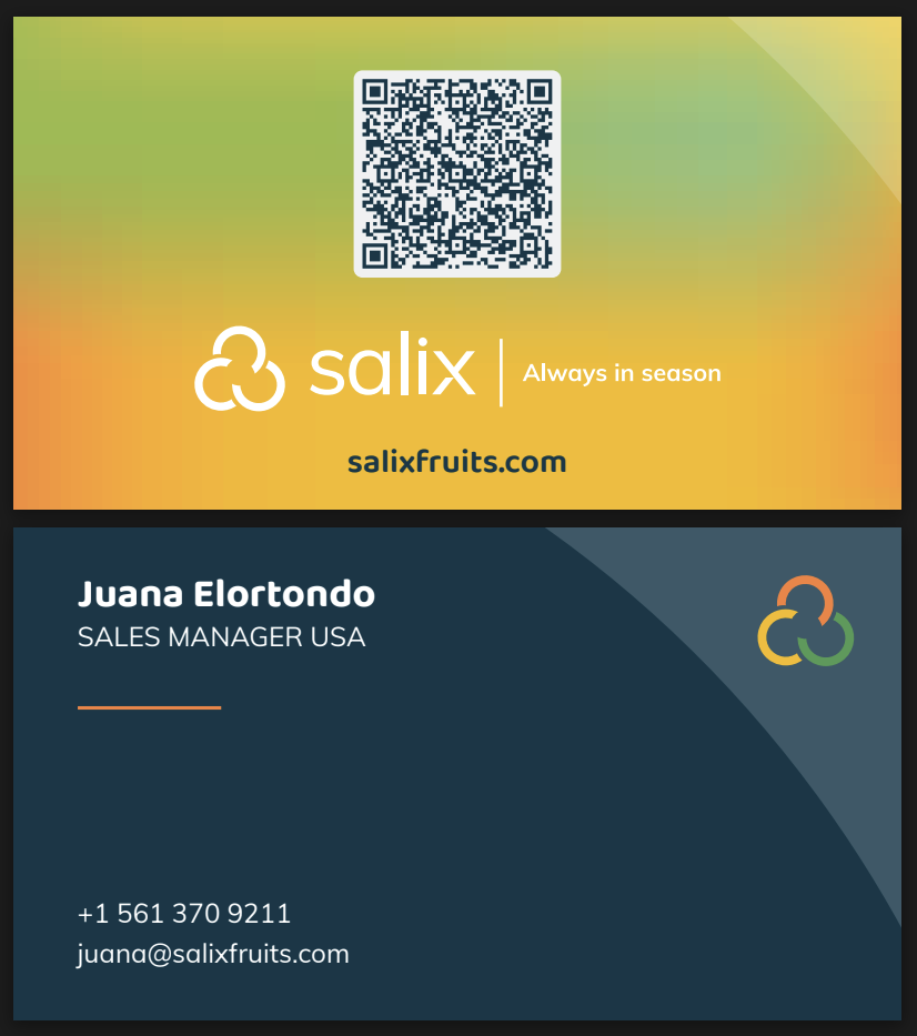
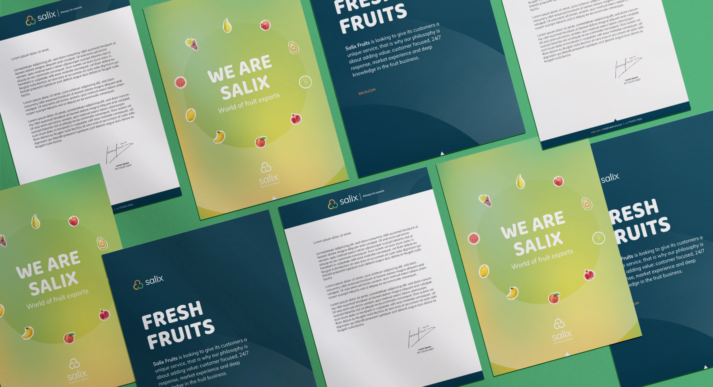
To revitalize the Salix Fruits brand, I lead the creative direction, meticulously updating the logo and forging a vibrant design language that would resonate across various platforms. Leading a team of creatives, I developed a comprehensive suite of visual assets, including multiple logo variations, a unified typography system, and a fresh color palette that aligned with the brand's tone of voice. We crafted and tested these elements across physical and digital media, from stationery to social channels, ensuring the evolution was significant yet familiar to maintain customer connection. This strategic refresh was designed to modernize the brand while honoring its well-established identity, enabling Salix Fruits to continue its rapid growth without alienating its existing base.
The brand today
Outcomes


